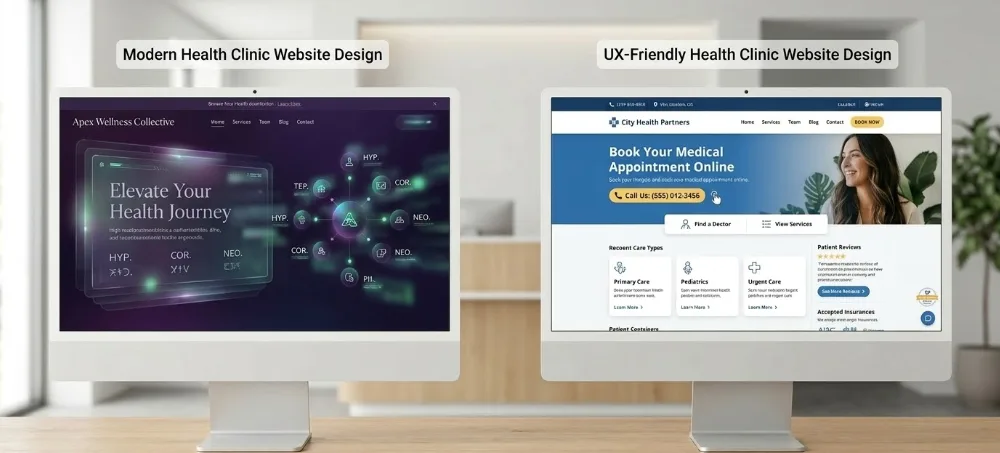
Prioritize UX Over Unique Design
Original design is tempting, but the data consistently shows that usability and familiar patterns drive more conversions. Here's how I approach it.

The Conversation That Comes Up Every Week
In most of my discovery calls, the conversation starts with design. Business owners have a vision. Something fresh, something their competitors don't have. I get it. When you're investing in a new website, you want it to stand out.
But over the years, working across hundreds of projects with marketing agencies and service businesses, I've noticed a pattern. The businesses that grow fastest online aren't always the ones with the most original designs. They're the ones where everything just works. Visitors land on the page and know exactly what to do next.
That's not a coincidence. And as someone who's spent years digging into analytics dashboards and user behavior data, I can tell you the numbers consistently back this up.
What the Research Shows
The Nielsen Norman Group found that clear, simple designs have conversion rates up to 400% higher than complex ones. Orbit Media analyzed 200 business websites and found that the top 20% in conversion rates had 40% fewer page elements than the rest.
A few more numbers that shaped how I think about this:
- Every $1 invested in UX returns up to $100, a potential 9,900% ROI
- Reducing visual clutter improves task completion rates by up to 79%
- Users form opinions about a site in 50 milliseconds, and 94% of those first impressions are design-related
- Sites that reduce cognitive load see 15–54% conversion rate improvements
These aren't edge cases. This is a consistent pattern across industries and markets. I see the same trends in my own client data when I compare pre and post redesign performance in Power BI.
What I See in the Data
My background is in data analysis. Python, SQL, Power BI. Before I was a tech lead, I spent years at Microsoft and Skype working with quality data at scale. That experience shaped how I approach every project today.
When I onboard a new client, one of the first things I do is pull their analytics and map out where users are dropping off. More often than not, the drop-off points aren't where the content is weak. They're where the design gets in the way.
A marketing agency I worked with had a beautifully designed landing page with a creative scroll-based navigation. It looked impressive. But the data told a different story: 73% of visitors never scrolled past the first fold. We replaced the creative nav with a standard layout and clear CTA above the fold. Bounce rate dropped by 28% in the first two weeks.
That's the kind of insight you only get when you measure everything.
Where Originality Can Work Against You
There's nothing wrong with wanting a distinctive brand. The issue comes when originality takes priority over usability.
Navigation is a good example. When a site uses unconventional navigation patterns, every visitor has to figure out how things work before they can find what they need. Most won't take the time. About 67% of leading mobile e-commerce sites still score "mediocre" or "poor" on navigation performance, and non-standard layouts tend to make this harder, not easier.
Choice overload is another one. Research shows that presenting users with 24 options results in a 3% conversion rate. Narrowing it down to 6 options brings that up to 30%. Sometimes less really is more.
Page speed matters more than most people realize. Google's data shows that as load time increases from 1 to 3 seconds, bounce rate goes up by 32%. From 1 to 5 seconds, it jumps 90%. Heavy visual effects and animations can contribute significantly to slower load times.
How I Approach Design Decisions
When I work with clients, I always start with the end goal: what action do we want visitors to take? Every design decision flows from that. And every decision gets validated with data after launch.
Lean on Familiar Patterns
Users have built-in expectations. Logo top-left, navigation top-right, clear page hierarchy. When a site follows these conventions, visitors spend their attention on the offer instead of figuring out the interface. Simpler navigation alone has been shown to drive 45% more clicks to purchase.
One Clear Action Per Page
Every page works best when there's one primary thing you want visitors to do next. When multiple CTAs compete for attention, conversion tends to drop. I've seen this play out in A/B tests across dozens of client projects. Focus brings clarity.
Prioritize Speed
Google found that every 100ms of delay costs measurable conversions. Amazon calculated it at roughly 1% in sales per 100ms. I always weigh visual features against their impact on load time.
Invest in Content, Not Decoration
Personalized content increases conversions by 42%. That's a better return than most visual enhancements. I'd rather spend the budget on messaging that resonates than effects that slow things down.
Results That Speak for Themselves
Some of the most impactful changes I've seen, both in industry research and in my own projects, are surprisingly simple:
- Expedia increased annual profit by $12 million by removing a single redundant form field from checkout
- HubSpot saw 120% more conversions by removing unnecessary form fields on landing pages
- Companies that lead with design-driven UX outperform competitors by 1.7x in revenue growth and 3.6x in shareholder returns
What these examples have in common is that the wins came from reducing friction, not adding visual complexity. I track the same types of metrics for every client I work with, and the pattern holds.

A Framework That Works
Here's the approach I use with every project:
- Start with the data. Before any design work begins, I pull analytics to understand current user behavior. Where are people dropping off? What's converting? What isn't?
- Define conversion goals. What specific action should visitors take? Design serves that goal.
- Use proven patterns. Channel creativity into the offer, the copy, and the value proposition. These are the elements that differentiate you without confusing users.
- Test and measure. A/B testing removes guesswork. Video-based A/B tests alone can improve conversions by 86%. I run tests on every major change and let the numbers decide.
- Track and iterate. The best-performing sites aren't launched and forgotten. I set up dashboards so we can continuously monitor performance and refine based on real user behavior.
Finding the Balance
This isn't about choosing between beautiful and functional. The best sites are both. It's about making sure that when design decisions are on the table, usability and data get a seat too.
When I look at a project, I'm always asking: does this element help the visitor get closer to taking action, or does it add friction? That question, backed by real data, has guided some of the most effective work I've done.
If you're planning a redesign or wondering why a good-looking site isn't converting, I'd be happy to take a look. Sometimes the biggest gains come from the simplest changes, and the data usually points you right to them.
Andre Tamm
Tech lead building digital solutions to real world problems using a data driven approach. I focus on AU and US markets, working with service based businesses and marketing agencies to turn complex challenges into scalable systems that automate workflows and deliver measurable ROI.
Ready to Build Something?
Let's discuss how I can help you build scalable solutions that deliver measurable ROI.